Overview
As a graphic designer for Drexel’s Campus Activities Board (CAB), the largest student-run organization on campus, I develop branding that engages and inspires. I first joined CAB after being struck by the stunning graphical work created by our marketing director, which sparked my desire to evoke that same sense of excitement and connection in the student body. Through my designs, I aim to not only promote our events but also encourage students to explore more with CAB—whether by attending events or becoming part of our organization.
Presented below is a selection of my favorite work from the last 2 years.
Selected Works
Hamilton! The Musical
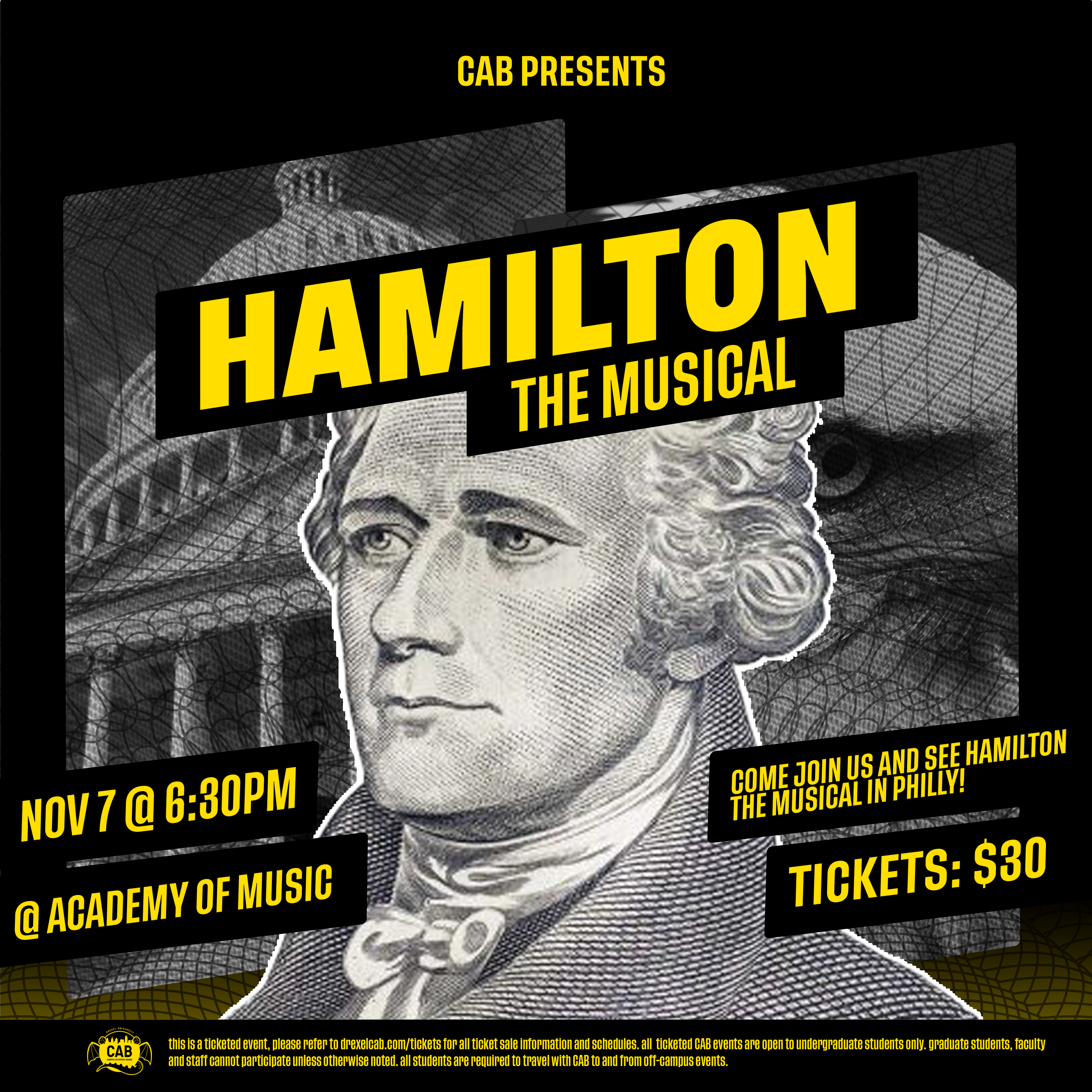
This graphic was designed for a trip to see Hamilton: The Musical performed live at a local Philly theater! Not only did I attend the event, but I also created the visuals for it. The majority of my inspiration for this piece came from a rug I saw on Facebook that had a texture reminiscent of old money. I wanted to design something that captured the essence of Hamilton without relying on the familiar imagery often associated with it — such as stars, gold, or silhouettes. Instead, I aimed to incorporate a sense of playfulness by making more direct references to America and its symbolism, like the eagle and a real portrait of Alexander Hamilton.
Superbowl Watch Party
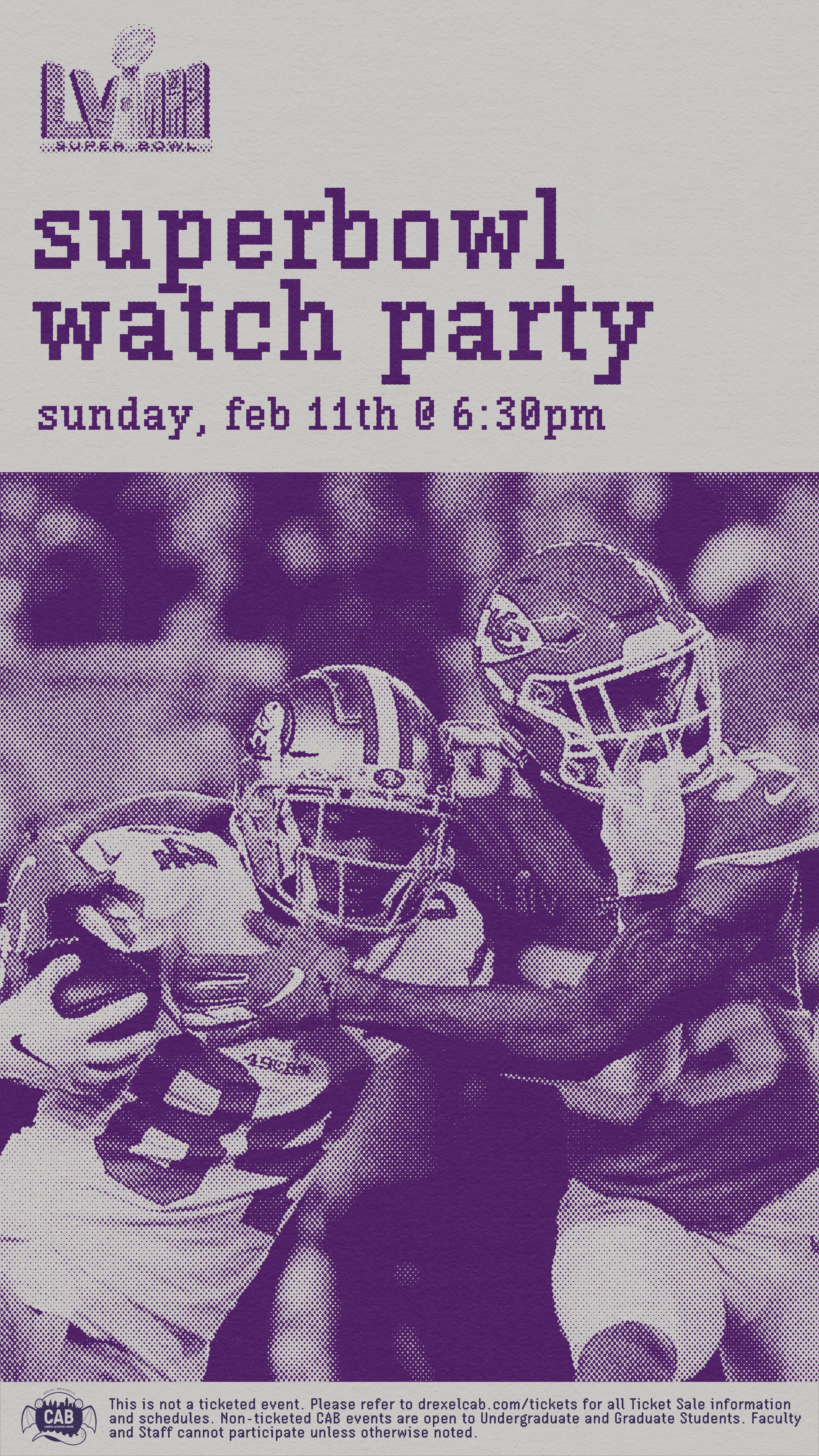
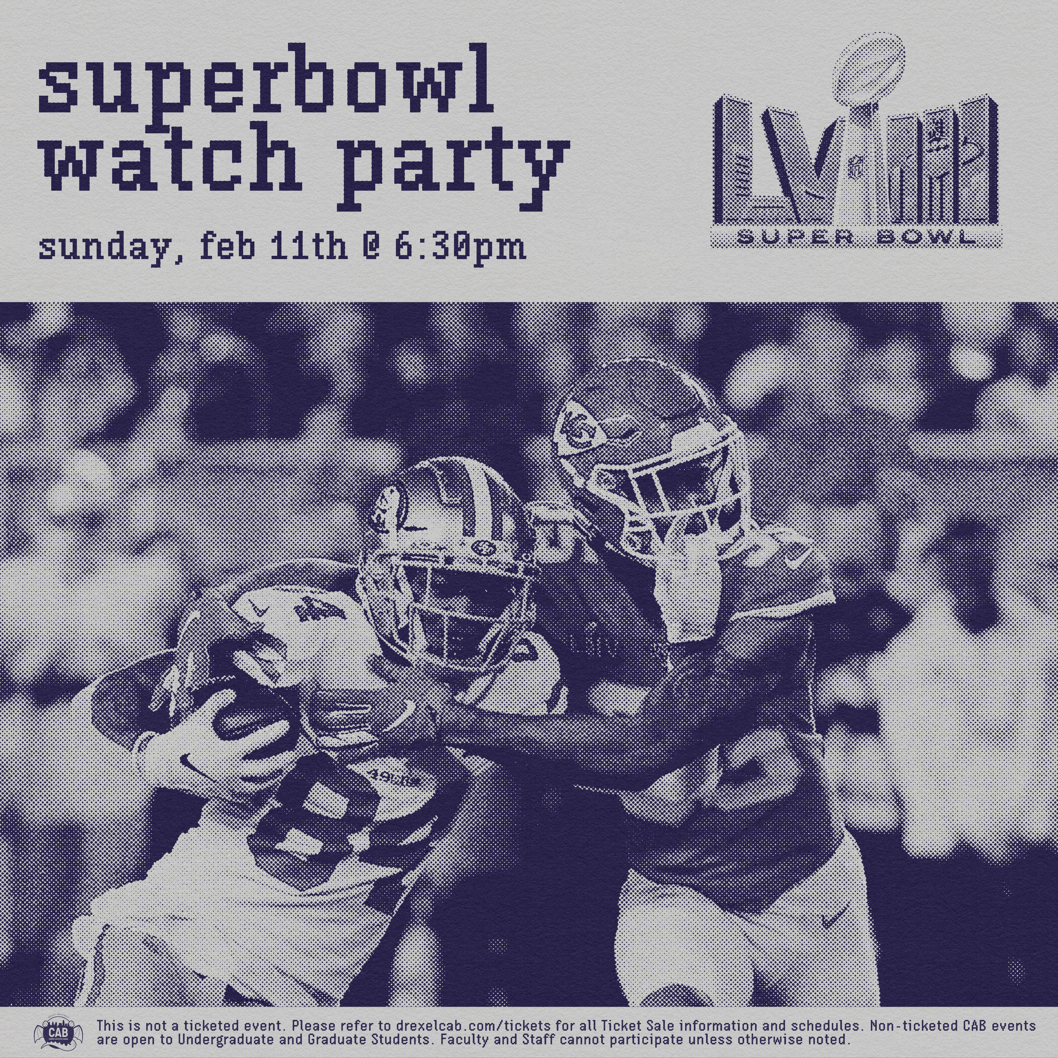
I’m a hockey fan myself, but I love creating sports graphics for all kinds of events! For this project, I wanted to explore a different direction than the usual aesthetic you see in sports design. Many sports graphics lean heavily on bold sans-serif fonts, sharp gradients, and modern color schemes. While that style is eye-catching, when I think of the Super Bowl, my mind drifts to nostalgia — old box TVs and memories of the past (especially since, for many, their team hasn’t won recently). I aimed to evoke the feeling of stepping through time, reflecting on past victories in the hope of securing another. To achieve this, I utilized some kits from True Kit and developed a monotone, pixelated graphic inspired by a retro aesthetic to complement the nostalgic tone.
Sadly, the Chiefs won.
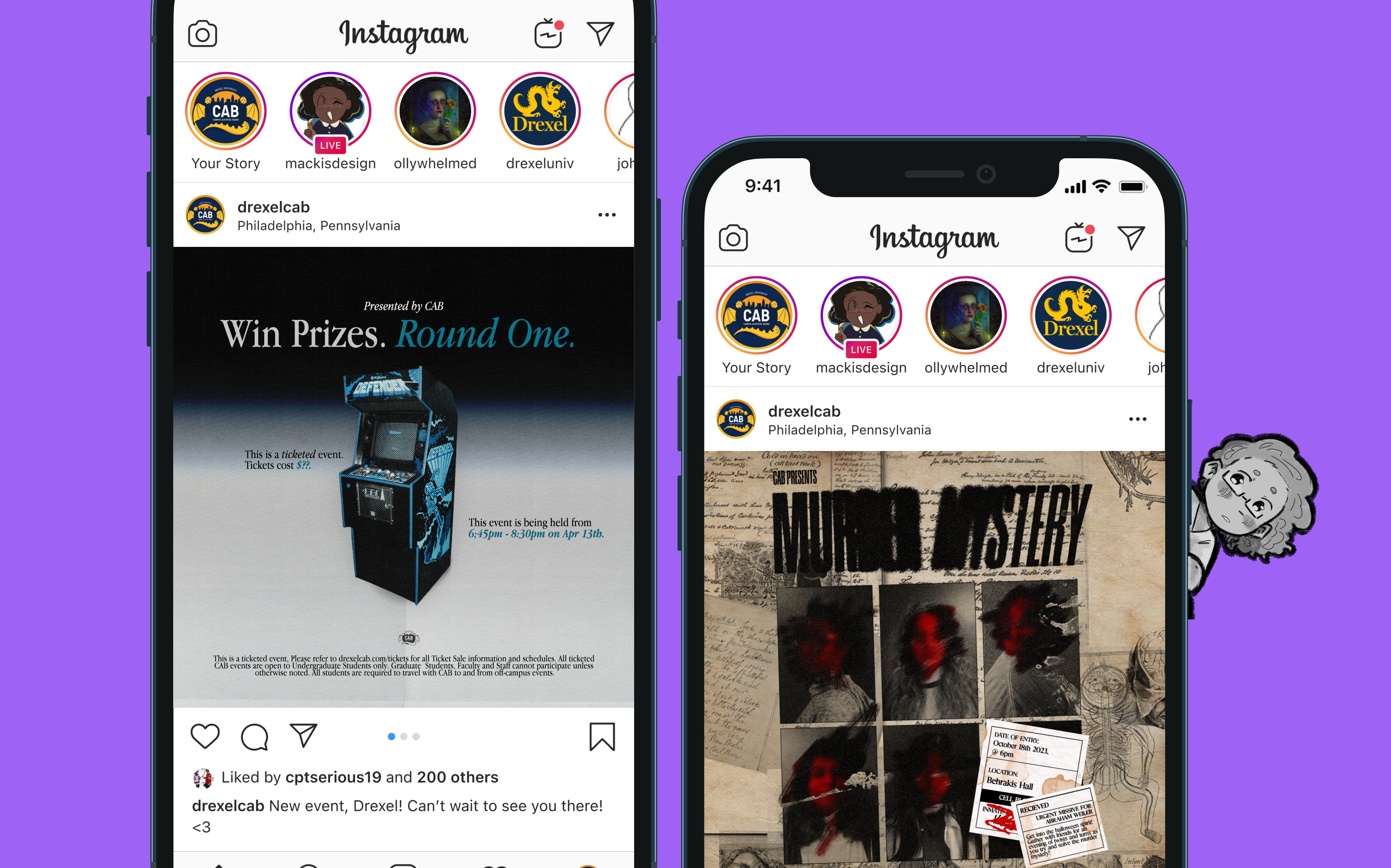
Round One
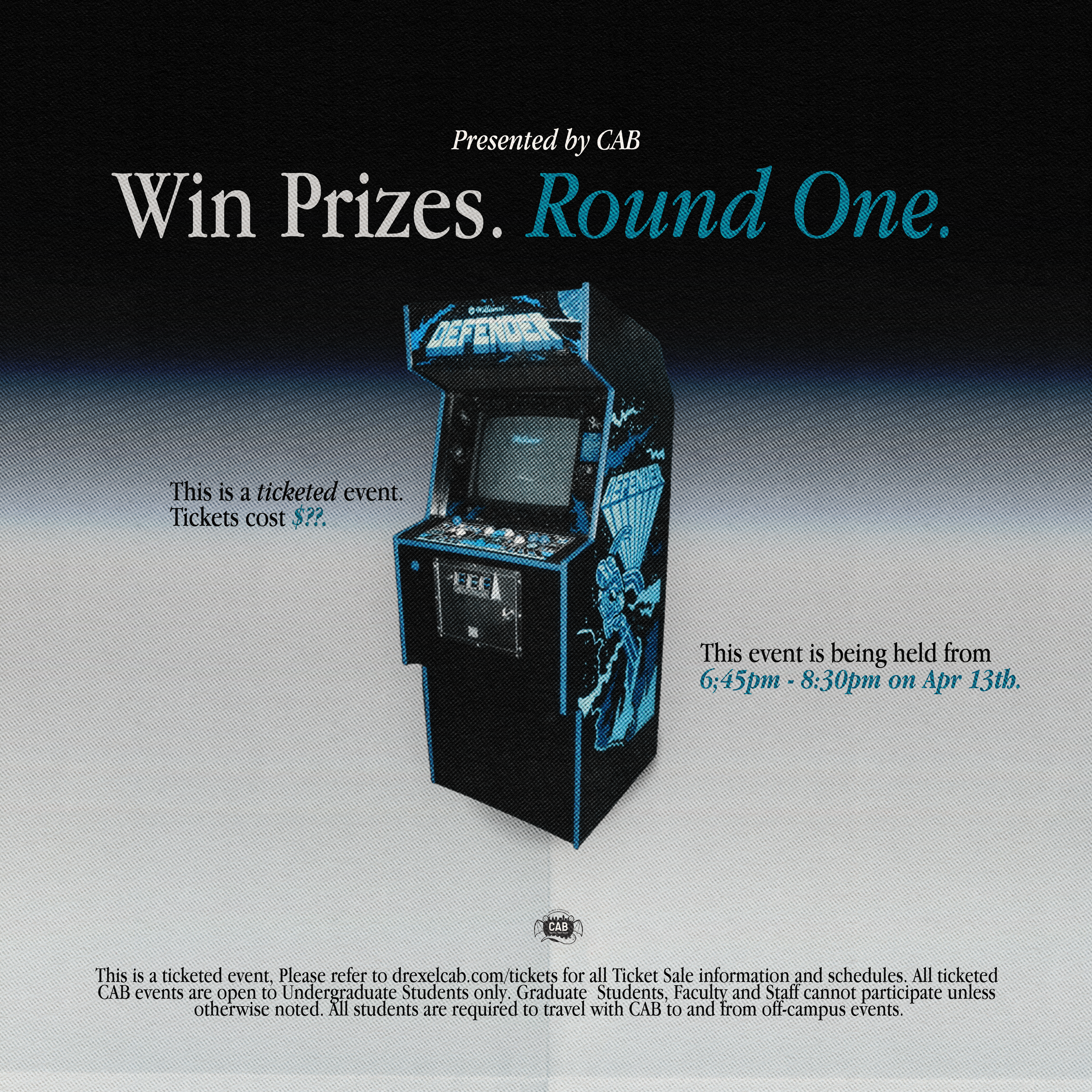
I wanted this graphic to resemble an old Apple ad. Apple's classic advertising made brilliant use of white space, gradients, and sharp serif fonts to complement the technology they showcased. Many of their older ads evoke a sense of wonderment, as if you’re witnessing something futuristic and groundbreaking. I aimed to channel that energy into highlighting a space filled with old-school arcade machines. Ruund One may showcase older tech, but it's still a place filled with wonderment and I wanted our student body to feel just as drawn in!
Murder Mystery
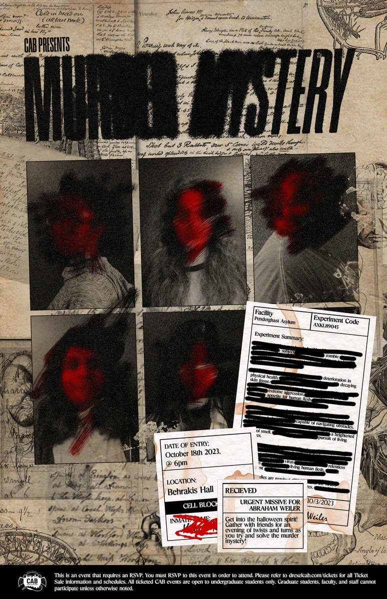
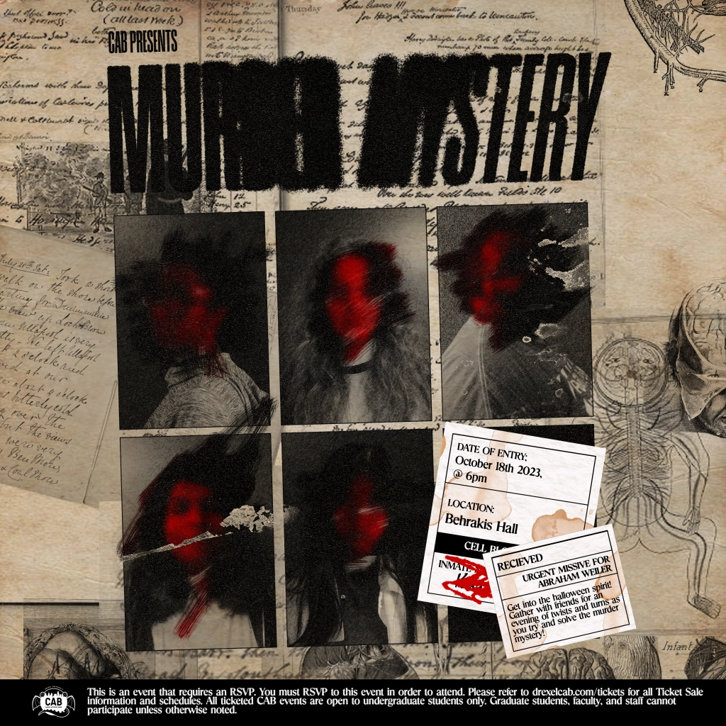
Designed for a Murder Mystery event centered on inmates being part of a cure for the zombie apocalypse, this project aimed to evoke the aesthetic of old, hidden documents—like uncovering secrets from the past. Drawing inspiration from police files and vintage anatomy journals, I crafted a visual narrative that blends mystery with a touch of nostalgia. To add a personal and playful element, each of the “mugshots” features a photo of a friend which was super fun for me!
