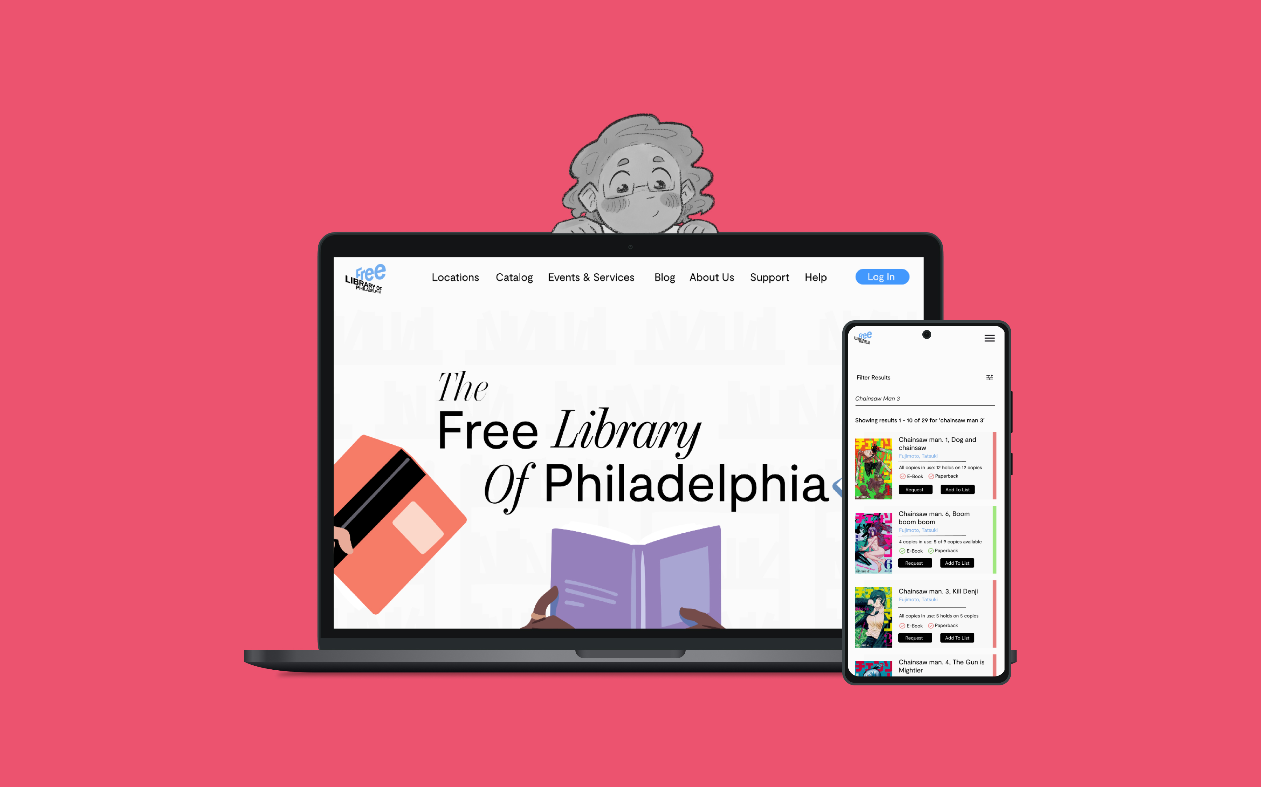
Over the course of two terms, we were tasked with completely redesigning a website of our choosing. Guided by our instructor, we developed interactive high-fidelity prototypes for a fully responsive user flow across three devices.
For my project, I chose to focus on the Free Library of Philadelphia, the largest public library in the city. The Free Library of Philadelphia is a vital resource for the city, providing a wide range of services to the public. However, the current website is outdated and difficult to navigate.
✎ PROBLEM STATMENT & RESEARCH FOCUS
Identifying Our User Demographic
When I was initially researching my target demographic, I came across two potential audiences: book-social-media users (teens – early 20’s; booktwt, booktok) and adults using the library as a resource for them and their children. Whereas book-social-media users were more likely to scarcely use the website’s broader features, as they were mainly focused on getting a library card, keeping up with new releases the library has, and any potential signings with popular authors — adults using the site as a resource seemed to be who the site was marketed towards.
These adults tend to trend older than book-social-media users. They are more likely to have kids and would like to more greatly engage with the library’s different events, programs, and services. They are also looking to keep up to date with new releases but will rely more heavily on the events’ features. As such, I crafted my user persona to be more focused on this lens (while still keeping in mind how the site could suit both these userbases).
Developed Persona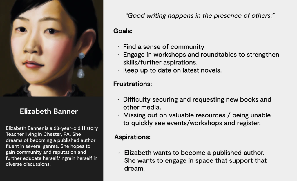
Elizabeth Banner is an aspiring author seeking community. She is especially tuned into library events and services like writer’s workshops, industry talks, and other potential resources she could use to help further her career. She is a Digital Native, she knows how to use technology, and as such, prefers cleaner, sleeker, more streamlined websites that allow integrations and/or prioritize efficiency. Elizabeth wants to keep up to date with the latest releases as well as further educate herself.
Market ResearchWith the user base identified, I sought to understand the site’s challenges, both through the user’s perspective and by comparing it to peer websites. I identified three core issues:
- Outdated Design: Like many public libraries, the Free Library’s site has a dated look. This deters its target audience of digital natives, who prefer cleaner, modern designs found on other major public library sites, such as the New York Public Library.
- Feature Clutter: The site is crowded with features that don’t enhance the user experience. For example, the blog page’s word cloud and tag system add unnecessary complexity without clear benefits, which discourages exploration.
- Lack of Visual Hierarchy: Unlike most websites, the Free Library’s content lacks a clear order of importance. Inconsistent layouts and design elements across the site make it hard for users to find specific resources and prevent the library from highlighting key programs and services.

✎ DESIGN PROCESS
Site Map and Visual Identity Development
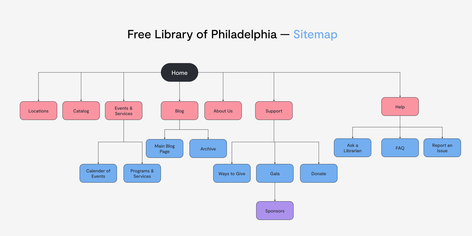
With the issues in mind, I pushed forward into developing a more streamlined visual identity and information architecture for the website.
User testing revealed confusion in navigation, particularly due to overlapping sections. Categories like "Support" and "Programs" had unclear boundaries, causing users to feel lost. Many users treated the "About" page as a catch-all for anything they couldn't categorize, demonstrating a need for better organization and intuitive grouping.
I also began drafting new branding and wireframes for the site, pushing forward in a minimalist direction (more in line with that of peer sites).
For my typography, I paired Moderat, a variable geometric sans-serif that scaled well across the site, with Chamberi Super Display Italic, which I featured exclusively in the hero headlines.
For my color palette, I wanted to go in a brighter, bolder direction in order to add more life to my minimalist redesign of the site. Much of the current website is made of lowly saturated reds, greys, oranges, greens, and blues, which felt outdated and mismatched. I thought blues, pinks, and purples both complemented each other and could represent a strong identity, especially for the hero illustration.
Visual Identity & Wireframes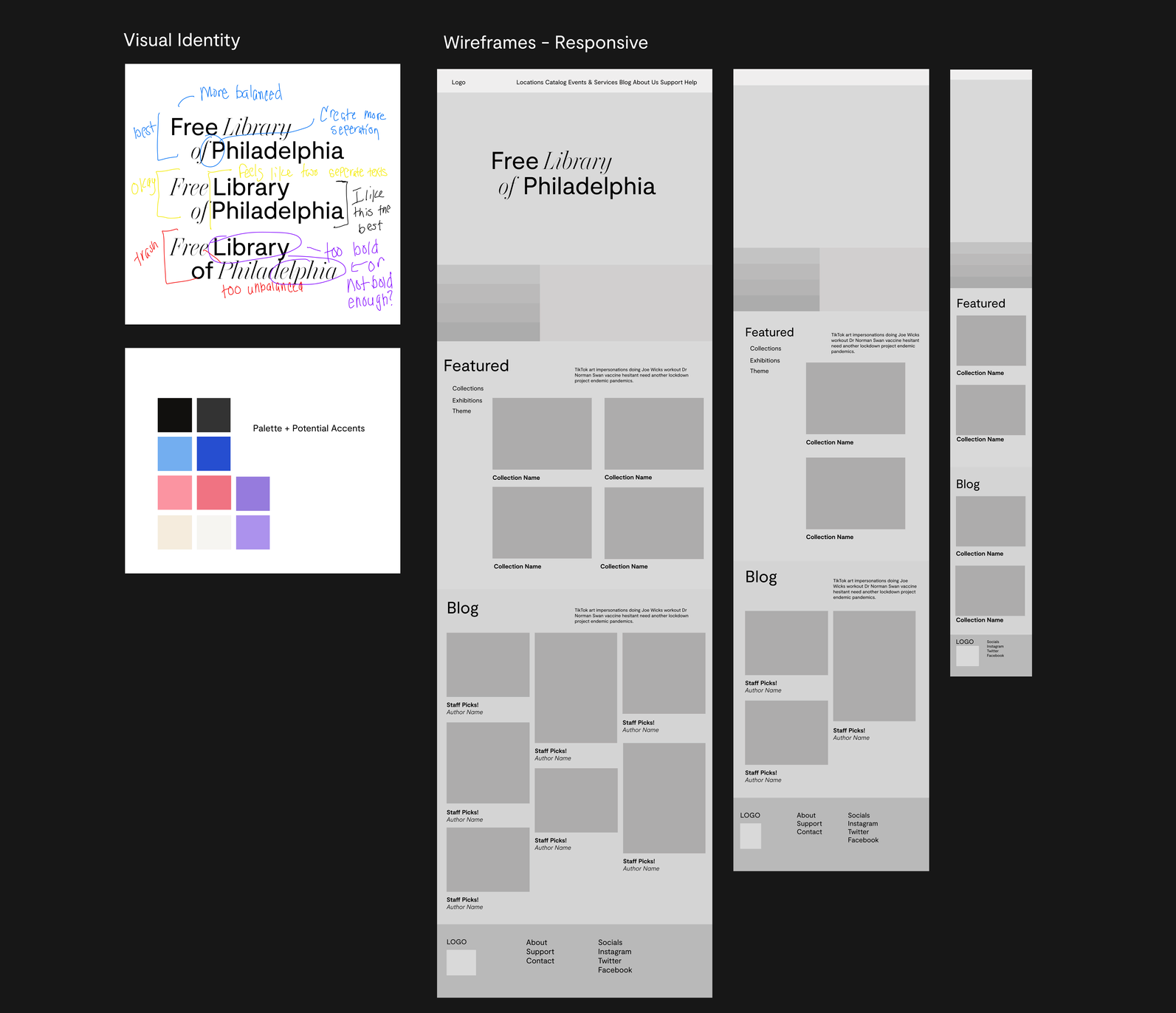
✎ INTIIAL PROTOTYPES
Term I and II
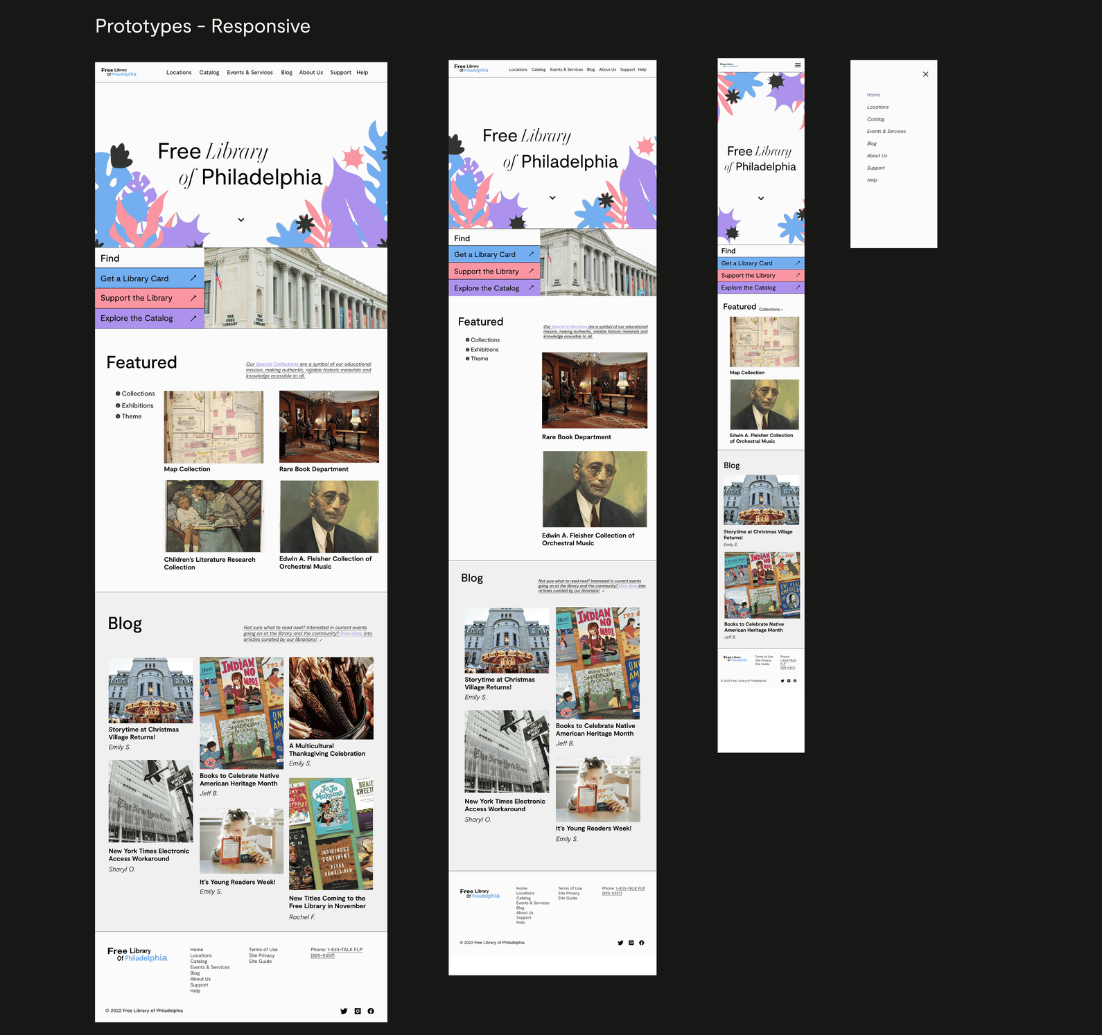
By the end of Term I, I had established a concept for the Free Library’s branding, identity, and homepage. However, after discussions with my professor and further reflection, I realized that the design didn’t meet my goals of modernizing the look, clarifying the hierarchy, and effectively showcasing library services. I reworked the project in Term II, refining the hero illustration, enhancing the color palette, and redesigning the layout to emphasize negative space and add vibrancy.
In Term II, I also mapped a user flow for placing a book on hold, addressing existing issues like inconsistent login visibility and an overcrowded catalog section. My redesign simplified the process, reducing cognitive load and aligning the user flow with best practices from peer sites.
✎ CONCLUSION
Deliverables & Reflection
Overall, I am proud of the work I did for this site! It’s my favorite project to date, primarily because I feel like I learned so much from the experience. Having to restart my project in the second-term was an incredibly invaluable opportunity and it taught me a lot of the importance of letting go of our ideas and iterating for the good of the user! I hope to expand this project one day, revisiting some of the concepts I didn’t quite get to explore in my first go-round.
