Overview
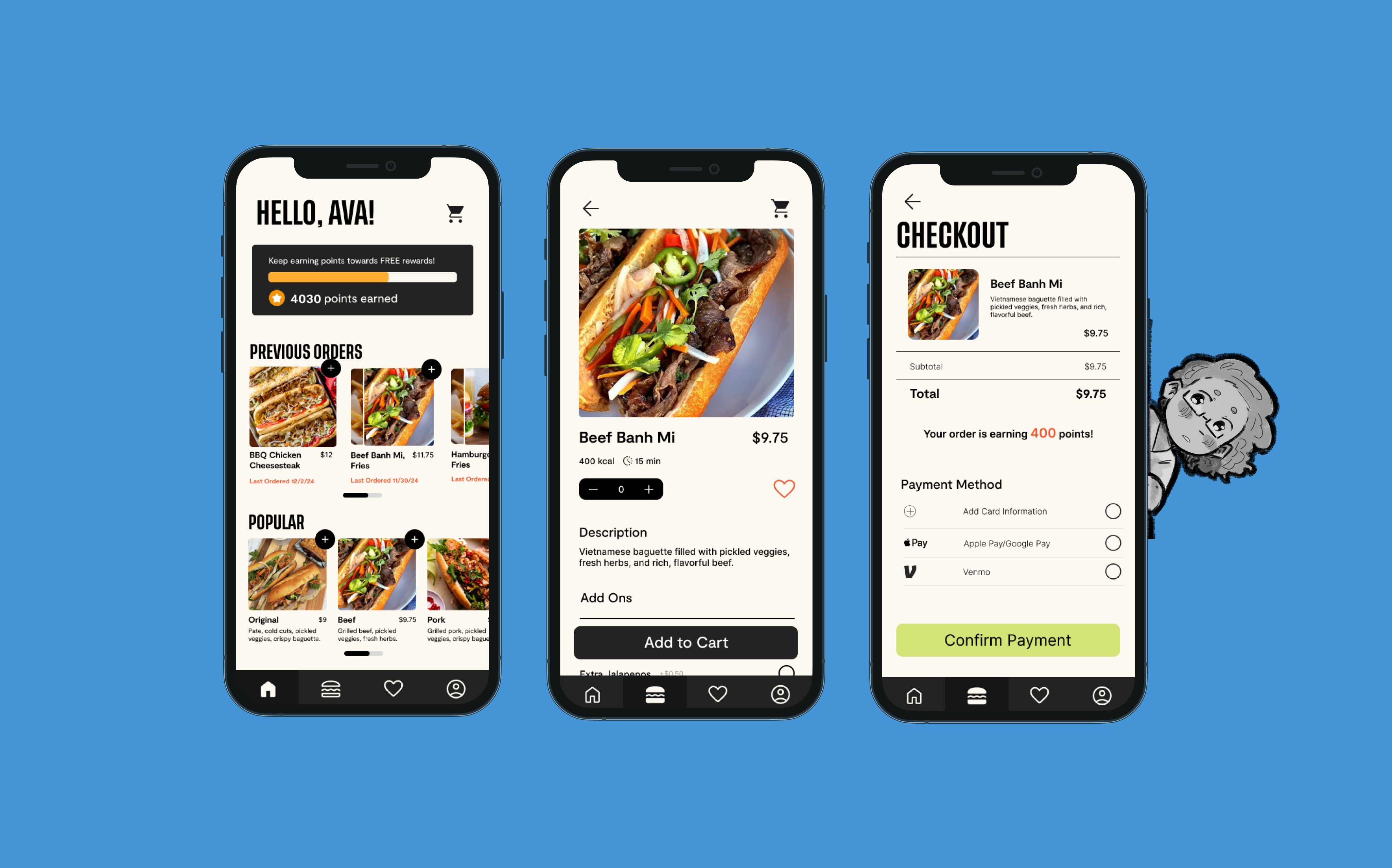
For IDM 215, we were tasked with developing a food ordering app for a local food truck. We were split up into groups and worked through the entire product development cycle over 10 weeks, culminating in a fully interactive prototype. My team chose to develop an app for Lennox Got Lunch. Run by a husband-and-wife duo, it is the only food truck on campus that serves Vietnamese-inspired cuisine. When we spoke with the owners, it was clear that retaining Lennox’s cultural roots was a priority. We wanted our redesign to highlight Vietnamese culture and showcase how it influences the truck’s identity.
Over the course of this project, I collaborated as the brand and interaction designer alongside Vy Le, Doyeon Yoo, and Susanna.
Research
Who eats at Lennox?
When we started this project, we wanted to explore a few key questions. Firstly, who primarily eats at Lennox Got Lunch? In order to begin building the foundation for our design, we needed to first understand how people interact with food trucks, what their challenges are, and what would potentially draw or detract them from exploring a standalone food truck app.
To answer these questions, we each conducted a fly-on-the-wall, followed by in-depth interviews with the owners to gather market insights. From this research, we identified two primary demographics for Lennox Got Lunch:
- College students – These users prioritize fast, affordable meals that they can grab quickly between classes. Convenience and speed are their top priorities.
- University employees – This group needs quick lunch options during work hours, but they often prioritize healthier choices and consistency as well as proximity.
- A unique and authentic experience – Customers enjoy supporting small businesses and feel a personal connection to the passion of the food truck owners.
- Fresh, made-on-site meals – They value the transparency of seeing their food prepared quickly and on-site.
- Variety and affordability – Food trucks offer diverse, flavorful options at prices lower than chain restaurants like Dunkin’ or Shake Shack.
While Lennox Got Lunch does serve a broader demographic as a food truck, its unique location within Food Truck Alley, which is sequestered deeply within our campus, means that the majority of its customers come from the university—primarily students and employees. As a result, we felt it was essential to style our user persona around these two groups.
What do they value?
Secondly, what do users value about the food truck experience? What would make them choose not just a food truck but to use a standalone food truck app over the many nearby restaurants or chain stores on campus? Through our conversations, we discovered that users are drawn to food trucks for several reasons:
Since many food truck customers view their visits as a unique, personalized experience, we wanted to ensure that our application design preserved that feeling. It was important to us that users wouldn’t feel like they were engaging with just another corporate platform or that their favorite food truck had “sold out.” Users emphasized that the small-business charm and laid-back nature of food trucks were major draws, so we prioritized understanding and maintaining those elements throughout the design process.
User Persona
These findings culminated in the development of our user persona:
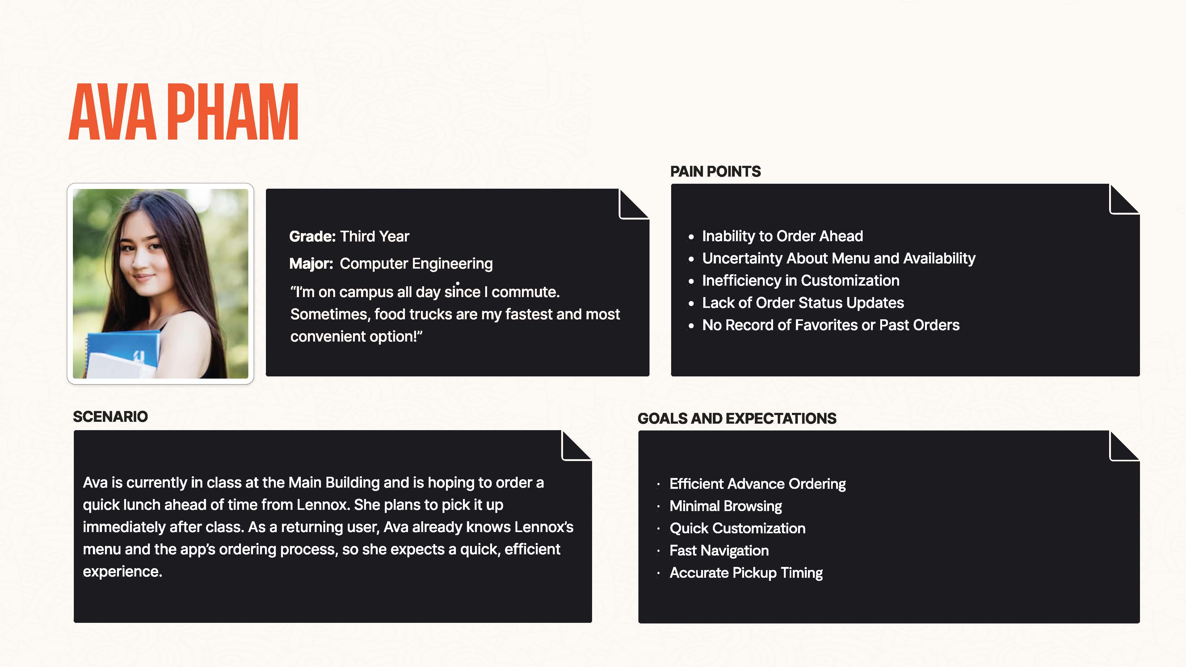
Ava Pham, a third-year computer engineering student here at Drexel University. Ava is often busy with back-to-back classes and seeks to order a quick lunch ahead of time from Lennox so she can pick it up right after class.
Both college students and university employees share several pain points when it comes to food truck experiences. A key issue is menu and update accessibility, as users often struggle to find information about food truck schedules, closures, the menu itself and its nutritional information or when items are unavailable due to ingredient shortages. Limited payment options also create challenges, with students favoring digital platforms like Venmo and employees expecting seamless card payments. Additionally, peak-order times result in long wait times, which is frustrating for both groups with limited breaks.
Ava’s goals and expectations align with her pain points—she wants to efficiently place an order in advance, quickly order her favorite items with minimal browsing, and have an easy-to-navigate app with saved preferences. She expects accurate pickup timing to avoid waiting unnecessarily after class.
Development
Initial Protoypes
Armed with a clearer picture of who we were designing for and what those users would value, we began developing our app.
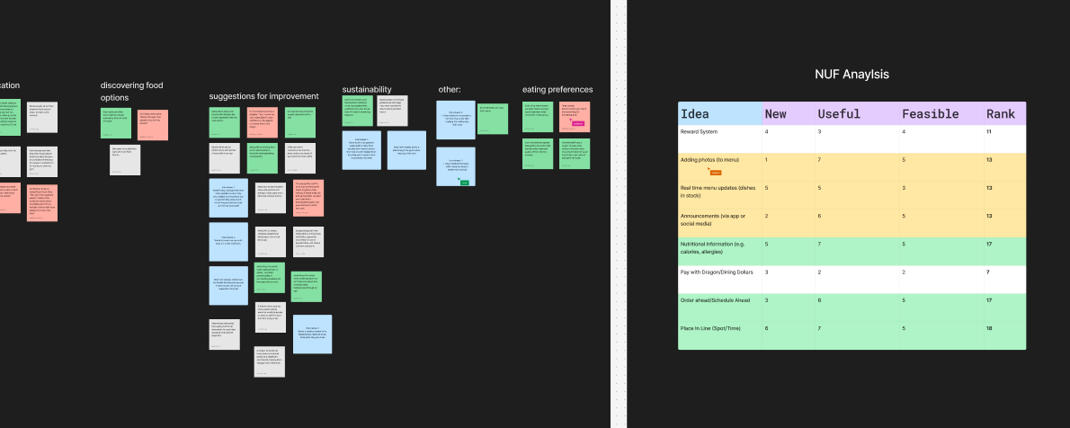
Building on the insights gathered during our initial research stage, we created an affinity map and conducted a NUF analysis to catalog the user needs we wanted to prioritize during development. Through this process, we identified several key elements users valued—not just for food trucks, but for a dedicated food truck ordering app. These priorities included:
- Easy access to essential information (menu, supply updates, nutritional info)
- Multiple payment options
- Ability to order ahead and schedule pick-up
- Rewards
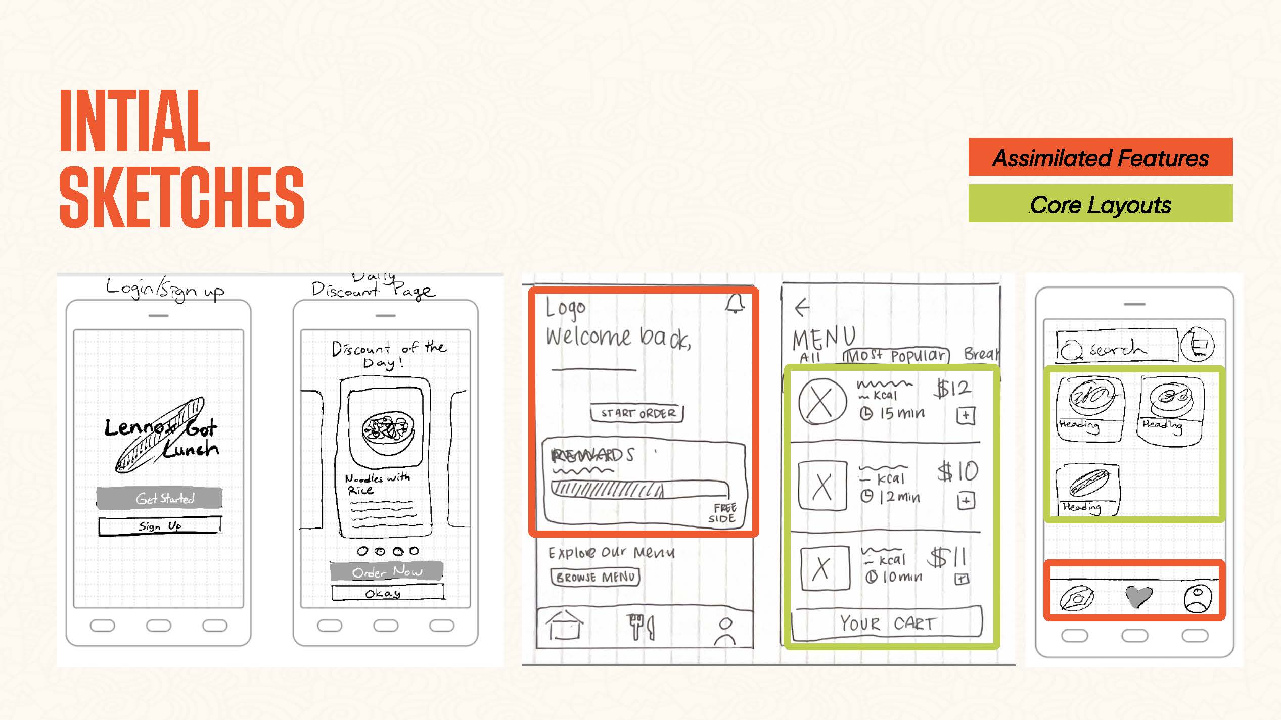
We started by mapping out the major features we wanted to incorporate based on user feedback. Each of us created our own sketches, which we then used to build a base user flow. This user flow outlined the major screens a user would encounter when ordering, for example, a Bánh Mì sandwich from the app, guiding them from point A to point B.
From these sketches, we developed our first low-fidelity prototype, upon which we conducted paper and digital testing.
Key Takeaways:
- Users felt that while most of our base flow was clear, there were some fragmentation when it came to adding items to the cart.
- Users felt like the app lacked discoverability. The app didn't drive users to explore other food items.
- Navigation was not intuitive.
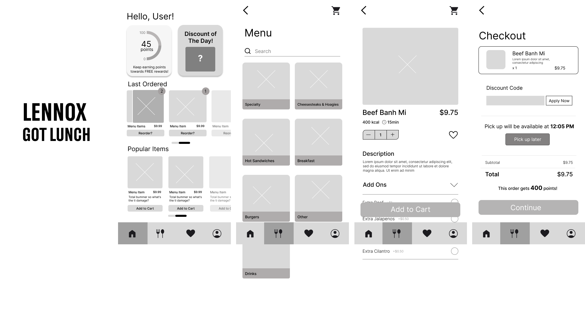
Moving into our next sprint, we sought to resolve the issues users identified as well as to establish our branding.
Menu A/B Testing
But, before diving into fully developing our branding and redesigning our screens to align with it, I wanted to address a major issue we observed during intial prototype testing: menu navigation. Many users found the menu unintuitive due to unclear categorization, leading to confusion. As I began refining our branding and implementing initial concepts, I prioritized ensuring the menu design fit seamlessly within this branding while resolving these navigation issues. This step was crucial to creating a consistent and user-friendly experience before finalizing the branded screens. Initially, we directly adopted the food truck's menu structure, but users routinely failed to navigate it effectively, and the menu layout didn’t translate well to an app interface.
To address this, I conducted an audit of the current menu structure to determine the most optimal configuration. I observed that the menu structure Lennox and many other food trucks utilize is better suited to restaurant menus than app menus. These menus often display all the different add-ons and variations plainly and group food into hyper-specific categories for easy scannability. While this approach works well when the entire menu is presented in a single view, it fails when users need to select a category first and then view the specifics.
This left me with two options: either restructure the menu itself or change the way we present menu information in the app. During my audit, I realized that restructuring the menu would require such drastic changes that it made more sense to focus on improving the presentation of the menu information. Altering the menu itself to align with user expectations would have led to significant modifications, so I prioritized improving how the menu was displayed.
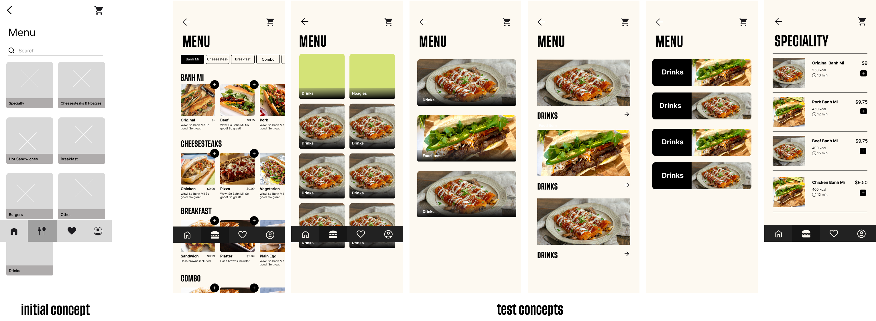
To do this, I sat down with one of my users and presented them with multiple menu design options to see which layout resonated best and provided the clearest presentation of information. The goal of this testing was to identify layouts that effectively communicated menu information in a clear and understandable way. Did the presence of images help users identify which foods belonged where? Were smaller or larger images more useful? Could users easily distinguish that they needed to tap in to view more information?
Ultimately, the design that resonated most with users was an expanded version of the home screen page. Users noted that being able to see everything at a glance made the menu much easier to navigate.
Key Takeaways:
- Users felt like the new menu resonated more with their ideas.
- App felt flat.
Branding
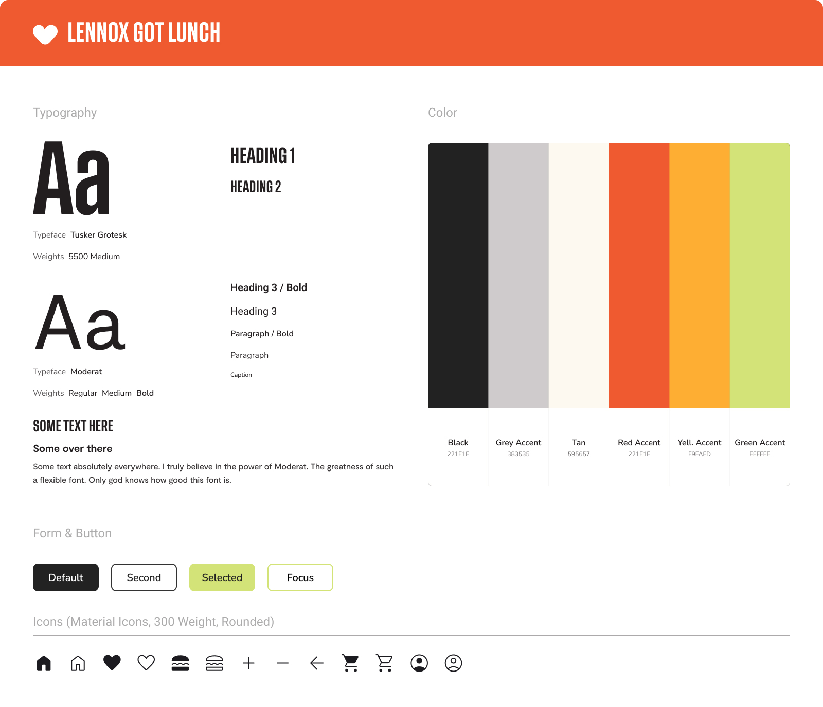
Resolving this issue gave me much more confidence to move forward with refreshing all of our prototypes to reflect the new branding and additional flow adjustments. Since Vietnamese culture played a significant role in shaping Lennox's heritage, we wanted to incorporate that into the branding. We focused on using warm yet vibrant tones to honor these roots. Additionally, during our inspiration search, we noticed that Vietnamese design often featured bold elements, including a variety of fonts and colors. To reflect this, we chose a bold heading font, Tusker Grotesk, and paired it with the modern and versatile Moderat for body text.
With the appication now fully branded and our flow fulyl fleshed out, we moved forward into our final prototypes.
Developing Interactivity
While, with each prototype, users felt more and more that we had a good foundation in terms of user flow, they still felt our app was lacking interactivelt. We got a lot of feedback that our app felt lifeless, especially when it came to core interaction like button presses or screen changes. Users wanted the app to not only feel more visually interesting but to give them more visibility of status. This insight prompted us to focus on adding more interactivity.
I developed a series of core components: radio, favorite, primary button (etc) for our major interactions. Then our team worked on adding supplmemtary interaction in page transitions, animations and pop-ups. The development of these interactions served to make the app feel livelier and more engaging. It also resonated with users quite well!
Final Protoypes
Results + Impact
Overall, I’m really proud of this project. I love how interactive it is and the special features we’ve included. This project gave me the chance to dive deeply into research-based design, which I found incredibly rewarding. Up until this point, much of my career has centered around designing for an audience but largely designing for myself. This time, I worked directly with users to solve problems they identified, and it was deeply gratifying to watch the app come to life with their suggestions incorporated. Seeing users engage with the app and recognize their feedback in its features was a particularly satisfying experience. Working with the owners was very fun and it was interesting to get a stakeholder perspective! I’ve realized how much you can learn from simply observing how users interact and what they consider important—not just in an app, but in the overall experience.
Since this is a two-term project, I have already been afforded the ability to go back to this project and make improvements in service of developing it into a real application. If I were to say I would adjust anything, I’d refine parts of the UI further, incorporate more microinteractions, and integrate more diverse brand elements.
